The Challenge
Barbican Library is a vibrant community hub that offers a myriad of services. Yet, many people don't take advantage of the services because the library relies on printed papers and community boards. How can we create a digital service to advertise all the library offers, engage more users, and foster community ties?
The Solution
Barb, the Billboard is an innovative DOOH (Digital OutOf-Home) media and interactive service center that lives at the entrance of the library. When Barb isn't running, she serves as an advertisement for all the library services. When someone interacts with Barb, they can register for upcoming events, check out books, and more.
Role
UX Researcher and Product Designer
Timeline
October 2023 - December 2023
Skills and Tools
Empathize: Desk research, naturalistic observations, and semi-structured interviews
Define: Empathy map, User Journey Mapping (current and future),
Ideate: Miro for team collaboration and Balsamiq for storyboarding
Design: Figma and Canva
Evaluate: User Testing
Team
Janie Hendrickson, UX Researcher and Product Designer
Daniel Cabral, Interaction Designer
Maleeha Saikh, Project Manager
Design Thinking Methodology
Phase 1: Empathize
User Research
The design project started with desk research, observations, and user interviews to gather comprehensive user research. I owned this phase of the design process.
Key Insights:
Barbican library users expressed a desire for events.
Most users mentioned the library’s polite staff, ambient physical environment, and user convenience.
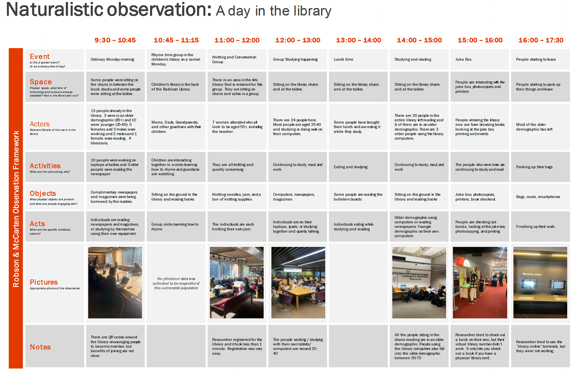
Naturalistic observation findings
PHASE II: DEFINE
Affinity Maps, Personas, and Current User Journeys:
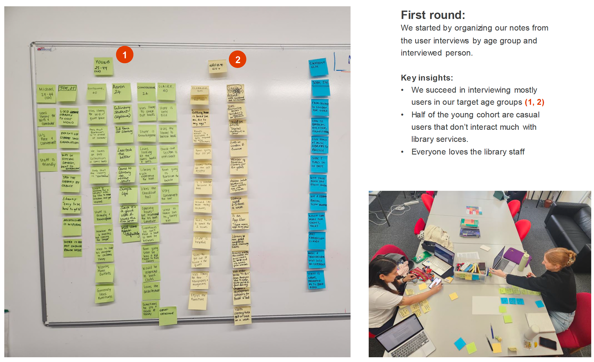
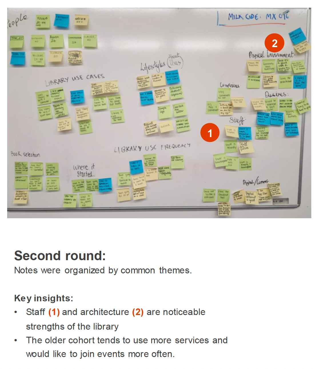
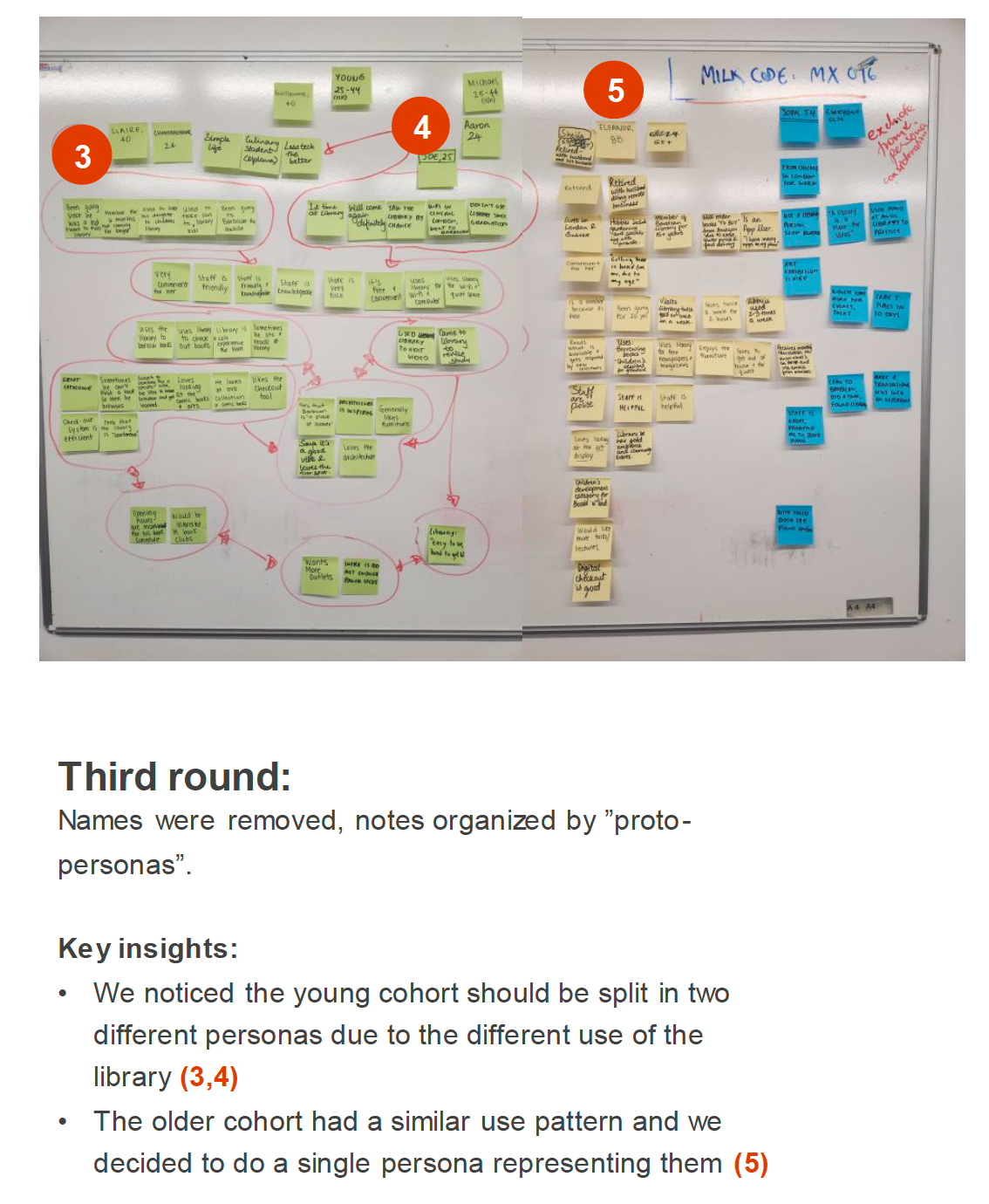
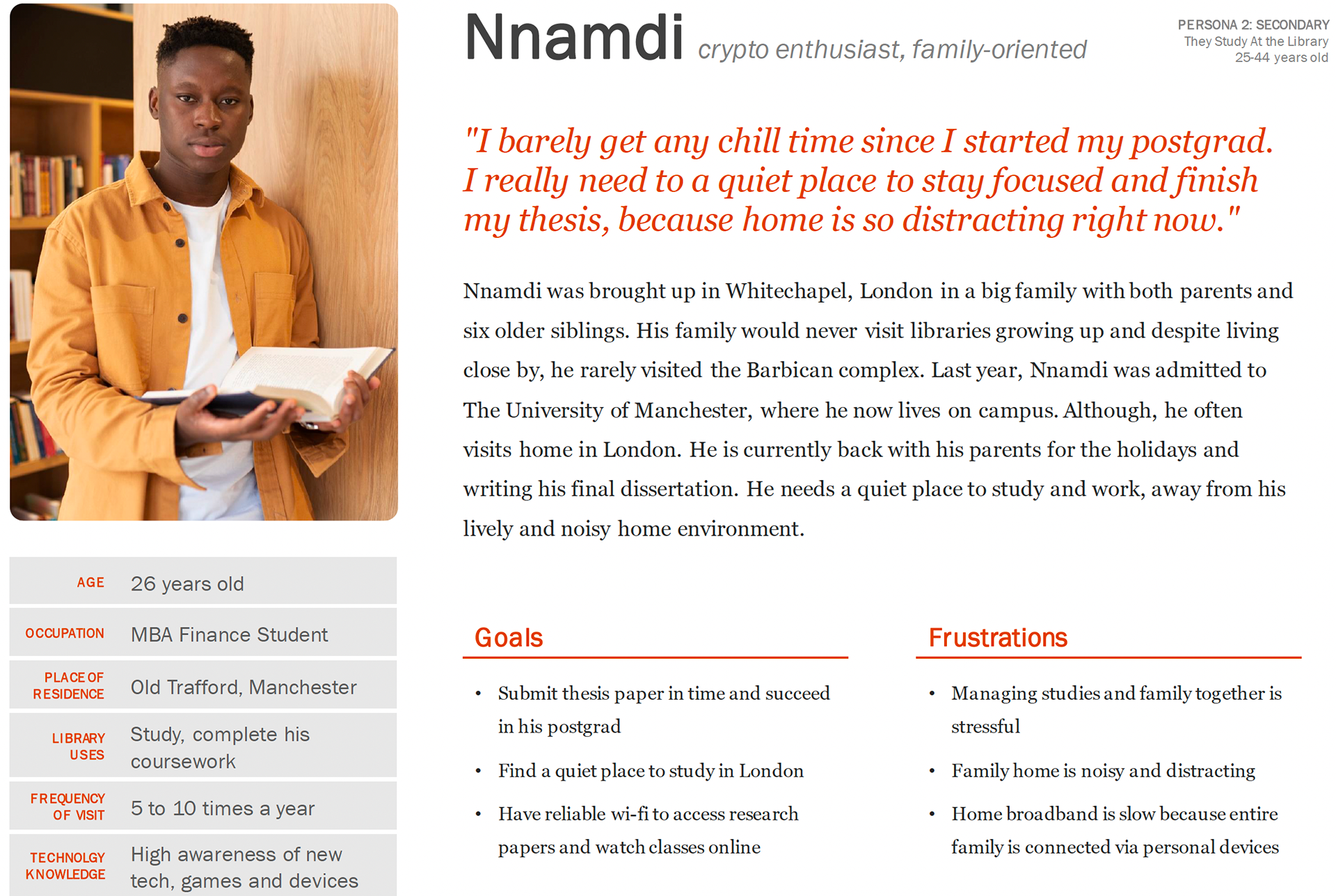
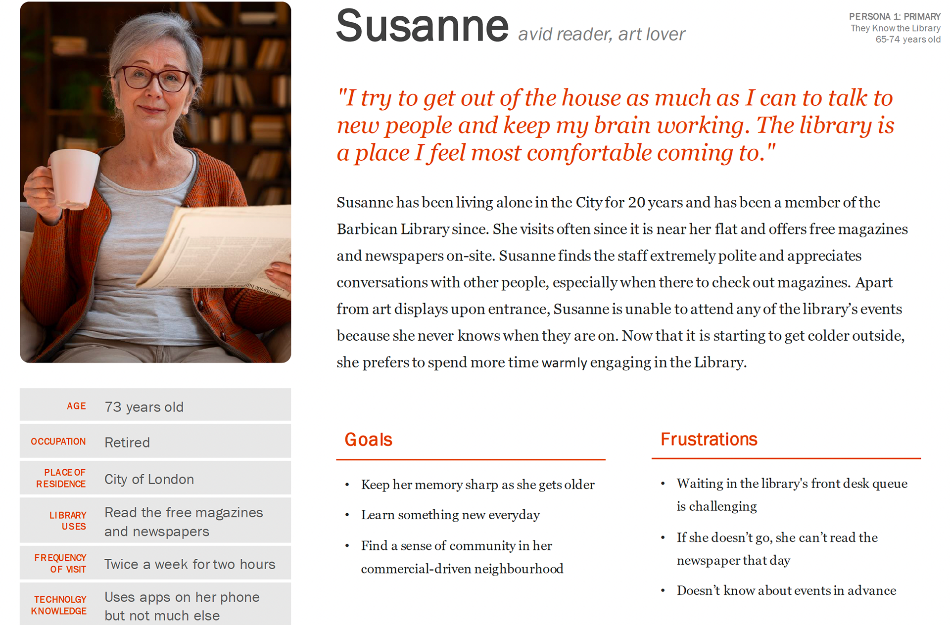
The data from our user research was then analyzed using affinity diagrams, personas, and current user journeys. The team met in person to create an affinity map using sticky notes and a whiteboard. Three rounds were completed until we came up with two personas.
Key Insights:
Two significant user-group themes surfaced
1. “They know the Library” and are long-standing members of the Barbican
2. “They study at the Library” and are university students or recent graduates.
2. “They study at the Library” and are university students or recent graduates.
Phase III: IDEATE
Ideation and Conceptual Design:
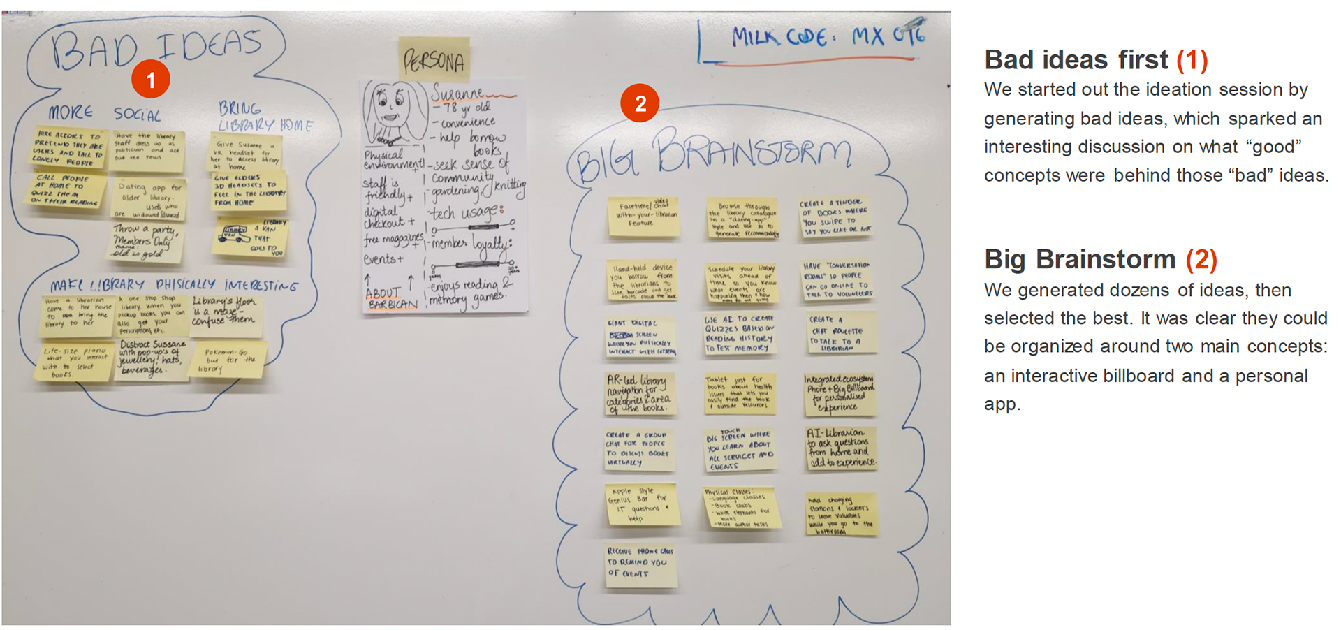
During the conceptual design phase, the team used five different ideation techniques to explore potential design solutions. We met in person and worked through each technique, promoting divergent thinking and ultimately creating the idea for Barb, the Billboard.
Ideation Techniques Used:
Worst Possible Idea
How Might We
Brainstorm
Storyboard
Sketching
Future User Journey
How Might We
Brainstorm
Storyboard
Sketching
Future User Journey
Key Insights:
Some of the ideas that emerged ranged from the convenience of browsing books using scanners, big screens, or dating apps’ swipe-right styles to the use of Augmented Reality or Artificial Intelligence technologies for visitor experience.
Two broader concepts were visible after ideation:
1. An extension of the library experience to the home through a smartphone app,
2. An enhancement of the on-site library experience through an interactive billboard.
Two broader concepts were visible after ideation:
1. An extension of the library experience to the home through a smartphone app,
2. An enhancement of the on-site library experience through an interactive billboard.
Worst Possible Ideas and Brainstorm Sessing
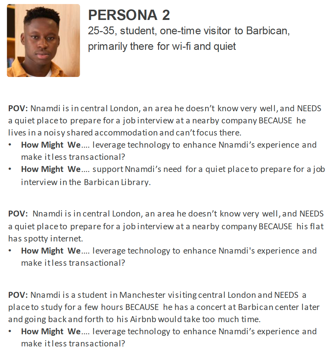
How Might We Statements
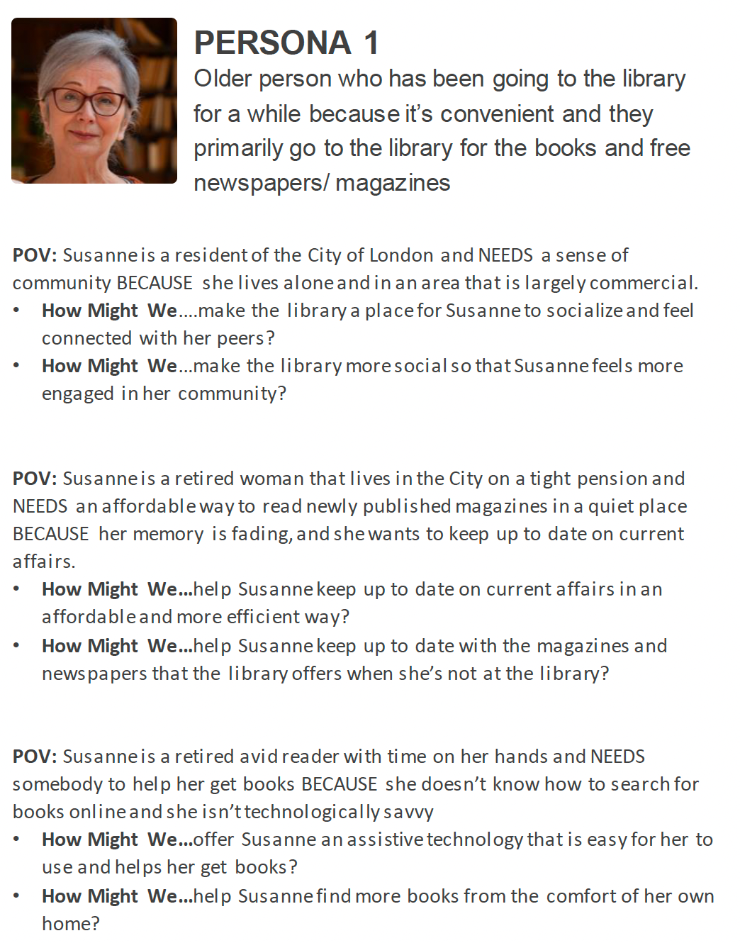
How Might We Statements
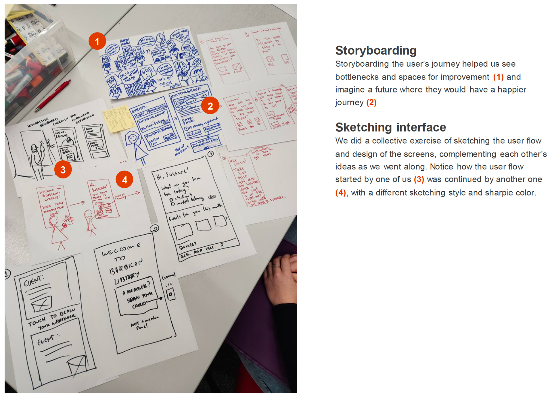
Storyboarding and Sketching
Phase IV: Design
Early Prototype, Design System, and Clickable Prototype:
The team first focused on creating early prototypes to inform us about how people interact with larger screens.
Key Insights:
Our research identified older adults as key users, so we quickly tested a life-size prototype using newspaper pages to simulate ideal screen size, height, and text size.
Role-playing different users, including one in a wheelchair, revealed that focus and interaction areas differ on large touchscreens, and much of the screen is hard to reach.
We then leveraged Norman’s 10 Heuristics for large screens and Barbican’s brand guidelines to develop a basic visual design system.
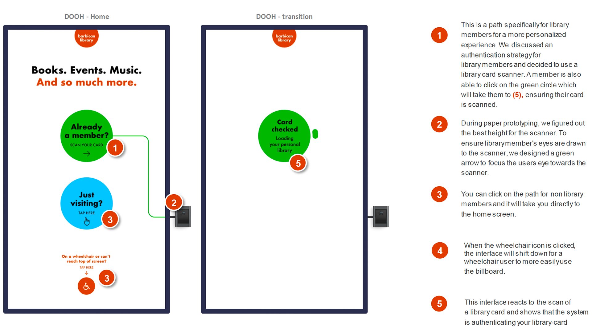
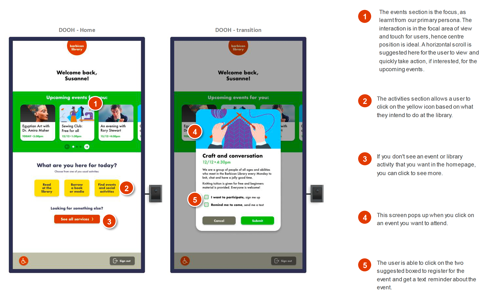
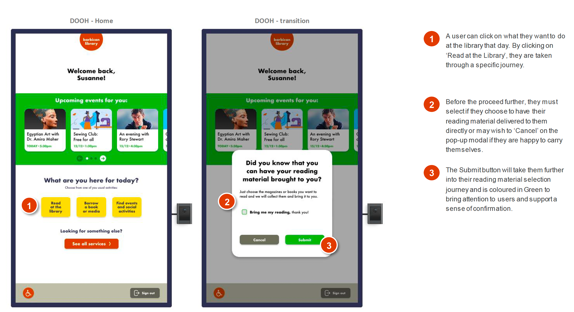
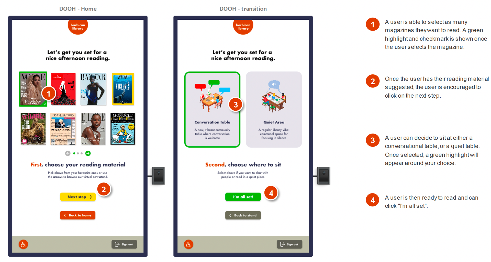
The final prototype from this approach is laser-targeted to serve the most important use cases uncovered in our research with maximum fidelity. We believe this mock-up offers users a realistic experience and allows them to test the most challenging aspects of large touchscreens: affordance and signifiers.
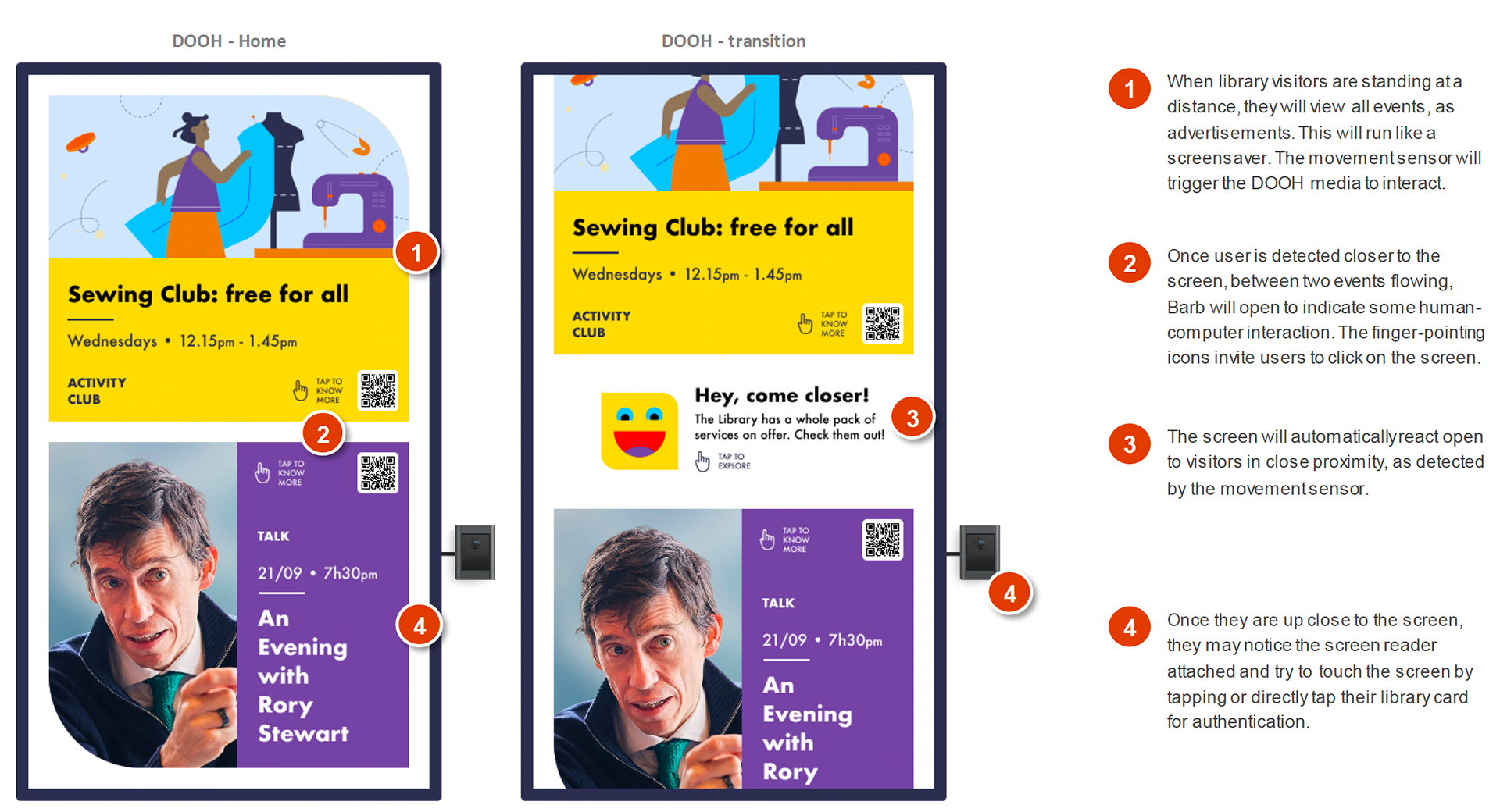
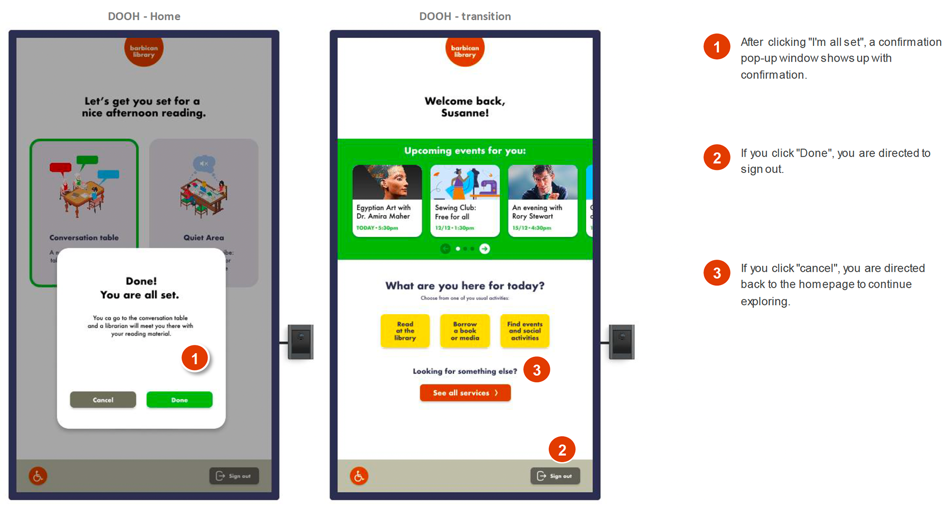
Clickable Prototype
Phase V: Evaluation
User Evaluation:
Once we had a clickable prototype with our main features designed, the team used Don Norman’s Seven Stages of Action and Gulf Principles to conduct a small-scale user evaluation. The metrics we used to test for success were effectiveness, satisfaction, and cognitive effort. As our participant performed the tasks with our prototype, I asked him to verbalize his thoughts as he went along. The team wanted to understand how effectively our user could perform each task and how satisfied his experience was using the billboard interface, so we implemented the Wizard of Oz technique.
I owned this phase of the design process, ensuring the "gold standard" approach was followed. I implemented a role-playing technique, asking the participant to role-play a 74-year-old library member.
Key Insights:
- Our evaluation found the user experience generally satisfactory, though some UI elements were more noticeable.
- The user quickly recognized the interactivity but tapped the 'I’m a member' icon instead of scanning their card, highlighting a gulf of execution for future prototypes.
- The user noted the content's height and area were evident.
- The tasks were completed, except for login, with satisfaction rated high and cognitive load low.
- We recommend enabling a 'click' on the 'I’m a member' button and will continue small-scale tests until no new insights emerge.


